ridezilla - Minimalistic Taxi Booking App
Developed a sleek and minimalistic UI design for the "ridezilla" Taxi Booking App, focusing on a dark ash-black color scheme with taxi car yellow accents. Utilized Figma to implement various design techniques for a seamless and visually appealing user experience.
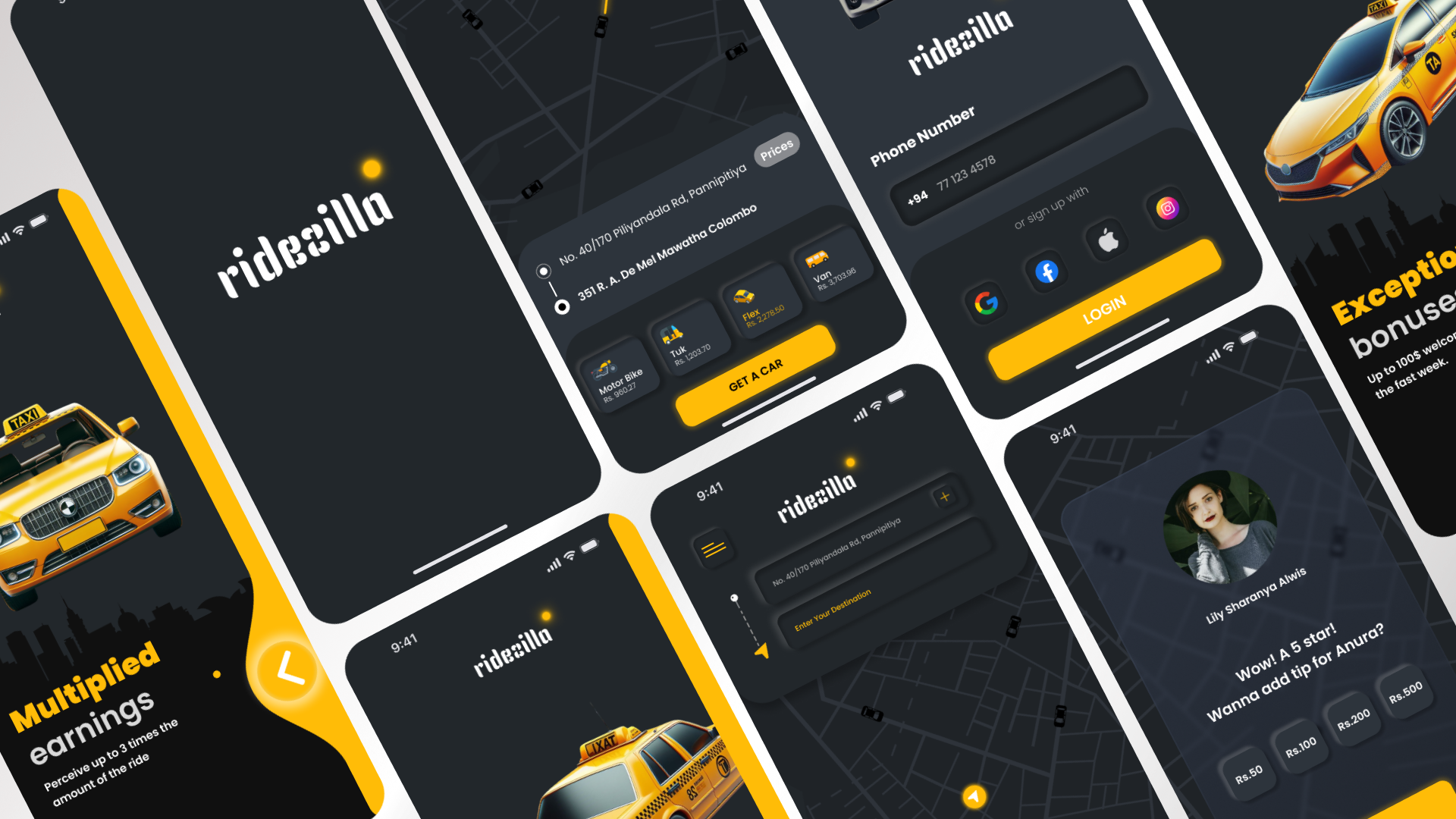
Key Sections
- Logo Display
- Attractive Wordings
- Login Section
- Find Vehicle
- View Vehicle
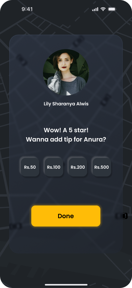
- Rate Section
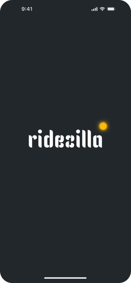
Single screen featuring the ridezilla logo for a clean and impactful introduction.
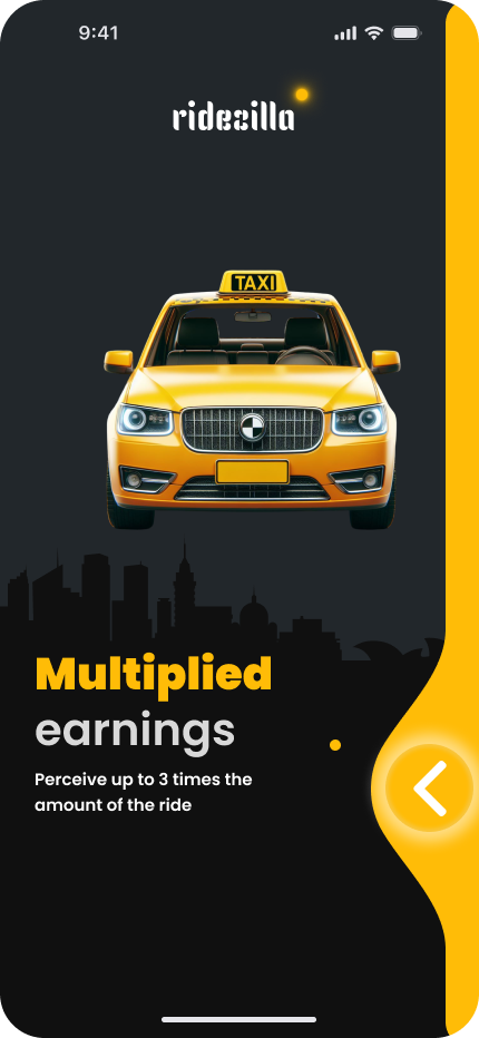
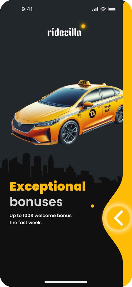
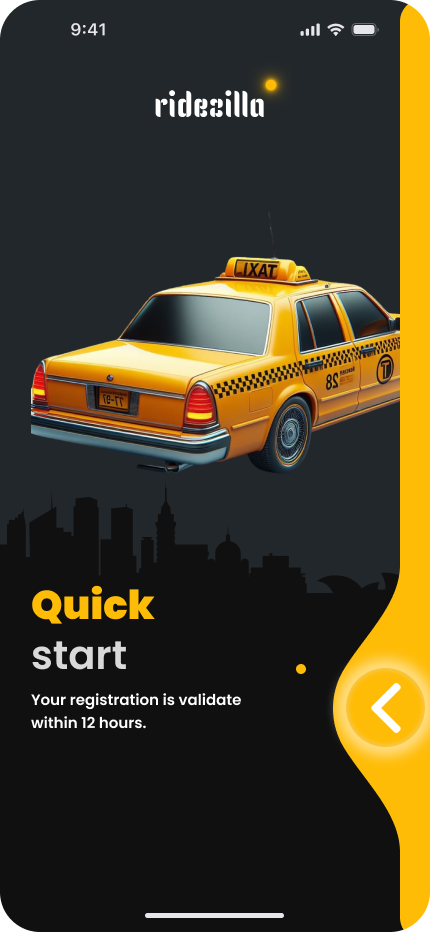
Engaging wordings accompanied by illustrations and images to create interest. Consistent use of dark ash-black and taxi car yellow shades for a cohesive theme.
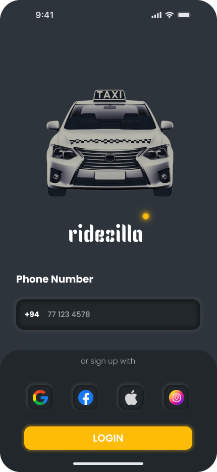
Simple login interface with a focus on user convenience. Users can log in using a phone number or sign up via selected social media platforms like Facebook. Utilized the Popine font for a modern and consistent typographic approach.
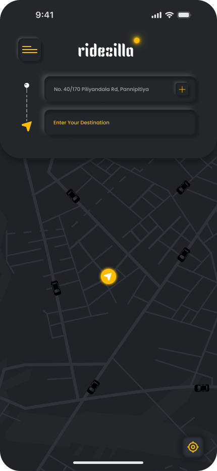
User-friendly interface allowing users to enter a location and find available vehicles. Dark ash-black background with minimalistic design elements for a sleek look.
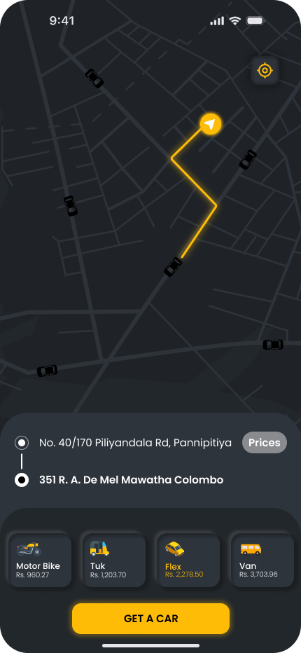
Displays various vehicle options with corresponding prices. Users can select a vehicle and confirm by pressing the "GET A CAR" button. Maintained the dark ash-black color scheme with subtle taxi car yellow accents.
Allows users to rate their ride experience. Displays user profile picture and name for personalization. Option to add a tip for the driver, enhancing user interaction. Consistent use of the Popine font for a cohesive and modern design.
Logo
Crafted a unique logo using a different font to establish brand identity and recognition.
UI Techniques
- Color Palette
- Typography
- Images and Illustrations
- Consistency and Minimalism
Dark ash-black and taxi car yellow for a minimalistic and sophisticated look.
Exclusive use of the Popine font for a consistent and modern typographic approach.
Integrated captivating illustrations and images to enhance the visual appeal. Maintained a clean and uncluttered design.
Ensured a consistent color scheme and font usage throughout the app. Embraced minimalistic design principles for simplicity and user focus.